THIS PIECE OF DATA IS LYING! (1/2)
September 25, 2014
 Data analysis is fascinating. With some good data and some appropriate tools, both becoming more and more accessible these days, you can see more clearly, explain what is happening and even predict the future.
As always in automated processes (and math), all tools have to be used carefully and becoming more accessible also means removing some barriers, becoming sometimes “too simple to use”.
In this first part, we will walk through a pair of cases where data appears to be lying.more–>
Fist case: The mall and the subway
In a mall we see people coming and going all day long, but couldn’t we predict the crowd a little bit more to adjust our sales animation?
Let’s measure people entering the mall every 7 minutes:
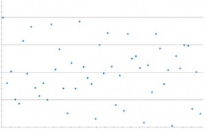
Based on this data (in fact based on one month of such data), and the use of the “Power Spectral Density Estimator” tool in the new version of our data analysis system, we were able to identify the frequencies at which larger groups of people come into the mall!
We have two main frequencies: 45 minutes and nearly 17 minutes that, used as a simulation, correlate quite well with the measurement.
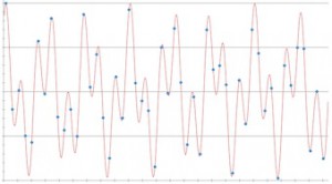
Well, knowing that the main train frequency during the day is 45 minutes, this is quite logical. But I can’t figure out why 17 minutes as none of the main subway schedules indicate this kind of timing. Can you?
Second case: The test
It is time to improve our software performance. A complete “live” measurement campaign has been conducted on our services layer, establishing the most comprehensive test to date, one thousand services response time in real conditions.
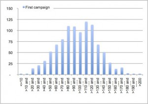
The network team thinks they could improve the results by prioritizing the best performing ones (which are the most often used ones, the code of these services is already quite optimized) using QoS on the network.
In my team, we believe code reviews are the way to go. We think we can improve the results by reviewing the services and giving some advice to the development team. We take the 100 “worst” performing services on the list and begin our work.
A month later, a new campaign is performed; we observe the same kind of measurement (globally), with a comparable mean and standard deviation.
And the results are…
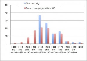
Very good indeed! As you can see, the improvement (data moving “left”) is 10-50% in each rank and some have been improved by at least 40%.
Well, not so good results for some friends of ours…
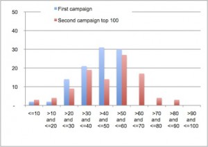
The “best performing” services are now even worse (data moving right) with some nearly doubling their result, most ranks are worse (the first two are a little bit better but it’s not worth it).
Based on those first data, we can conclude that the network was already very well setup and should be set back to the previous settings and we can schedule code reviews for the next 100 “worst performing” services to evaluate more closely the ROI before generalizing this approach for every service used in critical applications.
But talking with our colleagues, we realized two very strange things:
- the network team finally didn’t set up priorities as the network monitoring tools showed a very fluid network
- the development team was swamped with a new mobile app to build and integrate and couldn’t integrate the result of our recommendations yet.
So no one did anything, but nevertheless the result changed dramatically. I can’t figure out why these results were so positive.Chance perhaps? Can you figure it out?
Interlude
Those two stories were a simplified illustration of things that can go wrong (or too good) when using data. Of course these data weren’t lying at all and were even showing us some interesting trends that will be useful not only in future analysis.
(Disclaimer: no real live data were used or hurt in this experiment)
In the next part, we will look closer at the tools we used and how it can be explained.

 English | EN