TOO MUCH, TOO EARLY
September 17, 2014
 Last week, we were in a discussion about a new mobile web interface for a client. We were looking for feedback on the design. The initial design was presented and we expected to get feedback about the usage of screen space and the navigation model or flow if you like. Instead we received a lot of feedback about the lack of brand identity and proper use of colours. Looking back at the situation the design was already too much like a realized interface, which hinted towards the wrong discussion. We should have had a much rougher prototype of the interface where the design was sketchier to get the focus on the right (lower) level of the design, not on finalizing it.more–>
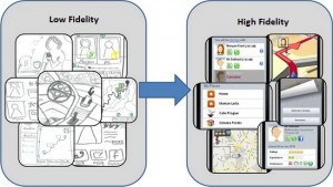
A two-step rapid prototype design would have fitted us much better so it seems. We needed a low-fidelity prototype for this kind of initial flow discussion and brought in too much detail too early. A sketchy look and feel would have given the participants the feeling that anything could still be changed, that every part of the design was open to discussion. Nothing was fixed yet. They might all be changing it all.
The design at hand was clearly more towards a high fidelity prototype where the feedback is expected to be around actual colour usage, branding and pixel perfectness. Such a two-step, low- followed by high fidelity approach, would have given much more feedback on initially the layout and navigation and would be perfectly followed by the second step of actual brand guidelines and perfect fit on multiple screens.
It’s clear that Too Much, Too Early is just as bad as Too Little, Too Late…
Here proposed is a two-step approach on the design, but I would really love to hear how many levels, or steps, you usually take (or expect) on such a design and room for feedback. How many iterations do you share (or want) for gaining feedback and how many do you use internally without the external feedback loop?

 English | EN