WEB UX DESIGNS THAT WORK OR FAIL, AND WHY…
May 27, 2015
The leader of our Digital Transformation practice in Dallas and SogetiLabs Member, David Yancey, asked all members of his practice to share candid user experience (UX) feedback on the best and worst websites. I compiled the following results, which though not earth-shattering, are good reminders of what to do and definitely what to avoid.
The Good
Clearly, the best websites are those backed by billion dollar business models, with hundreds of developers, UI/UX designers, architects and testers revamping and fine-tuning their production web properties for over a decade. Despite the ungodly amounts of money and resources, you can only dream of having one on your next project. Here are some obvious, but worthy-to-repeat website designs and tips:more–>
Great Websites
Outlook.com: Microsoft Email, one thing Microsoft got right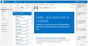 |
Google.com: Google, as in “Let me Google that for you, Mr./Ms. Client”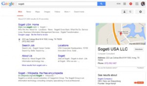 |
BofA.com: Bank of America–I just got paid! How am I already negative?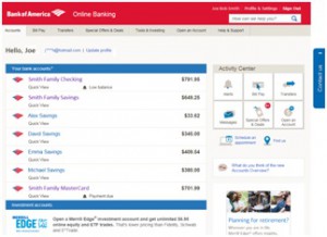 |
Amazon.com: Where everyone buys everything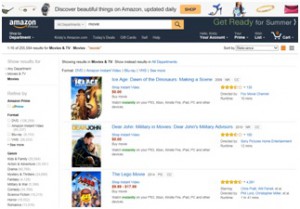 |
Netflix.com: The largest collection of horrible, but streamable movies and television series ever made, along with a few good shows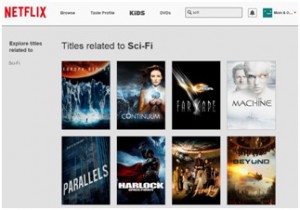 |
Cool Features
- Innovative usage of scrolling feature and CSS
- Clean and simple UI
- Fast load times
- Mobile and desktop responsive websites that resize well and are easy to use
- Desktop capabilities in the website like drag & drop, and right-click features
- Good cross-browser coverage (Chrome, Firefox, Safari, IE/Edge, mobile browsers, etc.)
- One or two clicks required at the most for common actions
- Eye catching images
- Solid search results with advanced search features
- Auto-save feature (because losing data really sucks)
- Up-to-date information/content
- Good use of background video and images (blurring, contrast softening, differential scrolling, etc.)
The Bad
These websites are average, if not completely bad. In fact, some survey respondents listed one or two of these websites as their favorites. But as the saying goes, one man’s trash is another man’s treasure. Although these websites may fall on either side of the fence, the annoyances they include are worth reducing in your own web projects.
Average Websites
Reddit.com: Feedback site where people mostly complain about stuff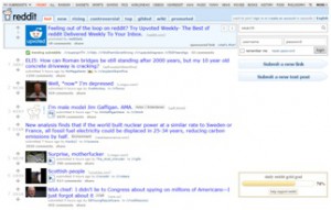 |
DallasNews.com: All the local news that’s fit to poorly present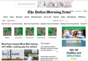 |
Frys.com: Online electronics site that is as big, scary, and overpriced as their brick & mortar store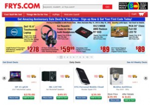 |
ESPN.com: Sports news delivered in an a dizzying array of formats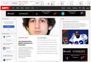 |
GMail.com: Google Mail–Surprisingly not great but steadily getting better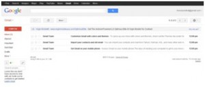 |
Annoying Features
- No hover-over/popup menu support
- Inconsistent search
- Poor mobile browser support
- Slow load times
- Too many scrolling/flashing widgets
- Information scattered and chaotically arranged/organized
- No auto-complete fields
The Ugly
It was a blast, and quite instructive, to visit the many, horrible websites the survey respondents submitted. I wish, I could list all of them for the laughs and tears they provided. Just like ugly dog contests, and epic fail videos, a quick search of ugly websites will return a plethora of UI/UX ideas to avoid, like the plague. An overwhelming number of these websites are small business websites, designed by the owner or a family member and were brought to life on the World Wide Web, when saying WWW was still considered cool.
Hideous Websites
Life.us.sogeti.com: Sogeti Life–Count yourself lucky that real life isn’t this painful except on Fridays |
Thamelmall.com: Nepal’s leading eCommerce site–Good luck avoiding Access DB exception landmines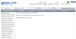 |
Cavs.mit.edu: MIT Center for Advanced Visual Studies–advanced visual torture tactics that is |
Warnerbros.com/spacejam/movie/jam.htm: SpaceJam Movie–Michael Jordan and Bugs are still laughing about this one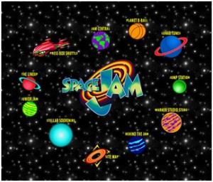 |
UglyTub.com: Tub Re-glazing small business site–if only we could re-glaze this ugly website |
Scary Features
- Web UI reminiscent of the 90’s
- Classic ASP web pages with Access Jet errors and line numbers being returned to the unfortunate users
- Cluttered web pages with image and text overload
- Fonts-o-plenty in more colors and varieties than a box of Good-and-Plenty
- Popup windows and ads because everyone likes playing the modern UI version of Whack-a-Mole
Summary
This is obviously not a comprehensive list of websites and features, but it is fairly representative. Send me a bribe, and I’ll be sure to include your favorite or most hated websites and features in the 2nd edition of this article, which I’ll write when my client sends me on an all-expense paid vacation to Alpha Centauri.

 English | EN